7. Example
Each deployment of the Analytics platform starts with the source data of the customer and the need for access to that data in a dashboard (for key performance indicators), in tables (for self-service queries) or reports (for compliance reporting).
In this example we will walk through setting up the platform. To make it easier to follow, there is a very limited number of patients, a few months worth of data, and just a few properties for each patient. Keep in mind that regular deployments contain much more data and that additional care must be taken to keep the platform performant, e.g. by partitioning the data, filtering data as soon as possible, and reusing data between widgets.
7.1. Explorer
The data table is created by an ETL process from the source data of the customer. In this example we will not look into how this data table is actually constructed.
7.1.1. Data table
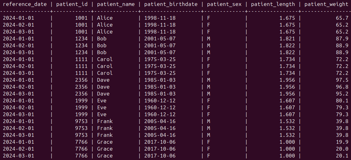
The data table in this example contains a patient at a particular moment in time in each row.

The first row shows all data about a patient named Alice on reference date 2024-01-01. The second and third row also show data about this patient, but at a later moment in time. Some columns, such as patient identifier or birthdate, do not change value from one reference date to the next for a particular patient. Other columns, containing e.g. measurements, are more prone to change. This is visible in the second row where the Patient Weight value for patient Alice is different from the first row. This indicates that somewhere between those reference dates, so in January of 2024, the weight has been measured and recorded for this patient.
7.1.2. Projections
All columns in the data table get their own projection. The Patient Name column for example has the following configuration:
projection:
  id: projection_patient_name
  name: Patient Name
  description: |-
    Name of the patient
  aggs:
    - count
  align: left
  expr: patient_name
The only aggregate that makes sense for a textual column is count, and the alignment of the column in the UI is left.
We add some derived projections, such as Patient Age that takes the existing patient birthdate and the reference date and calculates the age at that moment in time:
projection:
  id: projection_patient_age
  name: Patient Age
  description: |-
    Age of the patient
  aggs:
    - avg
    - count
    - max
    - min
    - stddev
  align: right
  expr: extract(year from age(reference_date, patient_birthdate))
We add some statistical aggregates (avg, max, min and stddev) because age is a numerical value. The alignment in the UI is to the right. The expr part of the projection contains the SQL expression to calculate the age.
The Body Mass Index (BMI) is also a derived projection, based on the length and weight of the patient:
projection:
  id: projection_patient_bmi
  name: Patient BMI
  description: |-
    Body Mass Index (BMI) of the patient
  aggs:
    - avg
    - max
    - min
    - stddev
  align: right
  decimals: 1
  expr: round(patient_weight / (patient_length * patient_length), 1)
For this projection we specify that we want one decimal to appear in the UI. This ensures that numbers such as 20 and 20.1 are nicely aligned, as they are shown as 20.0 and 20.1.
There is also an aggregates.yaml file which lists the possible aggregates that can be used in the projections:
aggregates:
  avg:
    description: average value
  count:
    description: count
  max:
    description: maximum value
  min:
    description: minimum value
  stddev:
    description: standard deviation
7.1.3. Filters
Typically, most of the columns in the original data table also get their own filter. The Patient Sex filter looks like this:
filter:
  columnname: filter_patient_sex
  name: Patient Sex
  description: |-
    Sex of the patient
  select: patient_sex
  filters:
    "All": null
    "Female": "%t = 'F'"
    "Male": "%t = 'M'"
The keys in the filters section are the texts that are displayed in the UI (e.g. Female), while the values are the SQL expressions that are used in the actual query to the database (e.g. %t = ‘F’).
There can also be filters for derived projections, such as Patient BMI:
filter:
  columnname: filter_patient_bmi
  name: Patient BMI
  description: |-
    Body Mass Index (BMI) of the patient
  select: round(patient_weight / (patient_length * patient_length), 1)
  filters:
    "All": null
    "< 20": "%t < 20"
    "20 - 25": "%t >= 20 AND %t < 25"
    ">= 25": "%t >= 25"
The select part in this filter is the same as in the corresponding projection.
7.1.4. Presets
An overview table is defined by the following preset:
preset:
  ref: overview
  name: Overview
  description: Overview of all patients
  category: examples
  public: true
  flattable:
    groupfractionorder: []
    groupfractions: {}
    order:
      - projection_reference_date
      - projection_patient_id
      - projection_patient_name
      - projection_patient_birthdate
      - projection_patient_age
      - projection_patient_sex
      - projection_patient_length
      - projection_patient_weight
      - projection_patient_bmi
    sortorder:
      - - projection_patient_name
        - ASC
  filters:
    filter_reference_date:
      - Most recent
  filterorder:
    - filter_reference_date
The overview table is a flat table (no grouping or pivot) so it contains references to our projections in the order section within flattable. The sortorder defines that the table should be sorted on the Patient Name column in ascending order. The filters and filterorder sections refer to the Reference Date filter we defined earlier.
The flat table looks like this in the UI:

A grouping table can be used to place all patients into groups, e.g. all females and all males. Subgroups can be made inside those groups, e.g. age groups:
preset:
  ref: age_groups
  name: Age groups
  description: Age groups
  category: examples
  public: true
  group:
    fields:
      - projection_patient_sex
    sortorder: []
    datafields: []
    groupfractions:
      filter_patient_age:
        - < 18
        - 18 - 30
        - 30 - 50
        - 50 - 70
        - ">= 70"
    groupfractionorder:
      - filter_patient_age
  filters:
    filter_reference_date:
      - Most recent
  filterorder:
    - filter_reference_date
The grouping table looks like this in the UI:

In the population row (the row without a number) we can see that there are 7 patients. The group of female patients is shown in row 1 and the group of male patients in row 2. Within each group, the ones aged below 18 are visible in column 3 (as a percentage of the group size) and column 4 (as a number).
We also define categories of presets in categories.yaml:
preset_categories:
  examples:
    name: Example tables
    description: Example tables
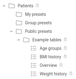
    parent: null
    locked: true
The parent section with the null value means that this category does not have a parent, i.e. it is located under the Public presets section as shown in the UI:

7.2. Analytics
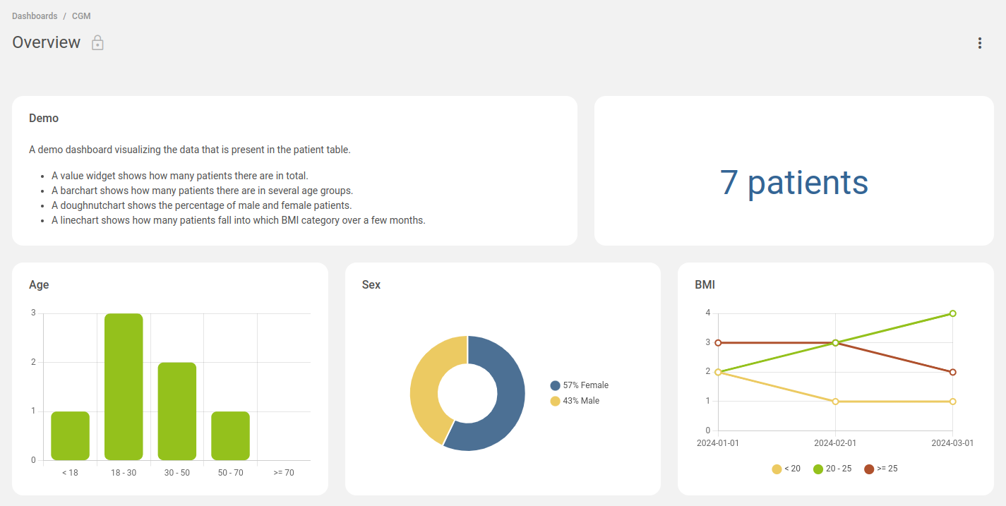
Based on the presets we defined in Explorer, we can now define dashboards and widgets in Analytics. We will create a single overview dashboard with five widgets:

7.2.1. Apps
We first need to specify which backend apps are available to fetch data from. In this example there is only one backend, an Explorer instance:
explorer_patient:
  name: Patients
  type: explorer
  url: https://explorer.mgrid.dev:8443
7.2.2. Dashboards
Each dashboard uses a 12-column grid and can have as many rows as needed. The sizes of the widgets are relative to this dashboard grid.
The dashboard configuration is as follows:
default:
  name: Overview
  category: category_examples
  widgets:
    - { "slug": "widget_text", "h": 2, "w": 7, "x": 0, "y": 0 }
    - { "slug": "widget_count", "h": 2, "w": 5, "x": 7, "y": 0 }
    - { "slug": "widget_age", "h": 3, "w": 4, "x": 0, "y": 2 }
    - { "slug": "widget_sex", "h": 3, "w": 4, "x": 4, "y": 2 }
    - { "slug": "widget_bmi", "h": 3, "w": 4, "x": 8, "y": 2 }
The widgets section lists five widgets with some configuration regarding the size and placement inside the dashboard. For example, the first widget called widget_text is 2 rows high and 7 columns wide, and is placed on the left (x is 0) top (y is 0).
7.2.3. Widgets
The configuration of the widgets is as follows:
widget_age:
  title: Age
  type: barchart
  options:
    chartjs:
      scales: { "y": { "min": 0, "ticks": { "stepSize": 1 } } }
    colors:
      - "#94c11c"
  data:
    sources:
      - app: explorer_patient
        table: age_groups
    transformations:
      data:
        - table(0)
        - poprow(0)
        - construct_array(input@4,input@6,input@8,input@10,input@12)
        - array_to_table()
      labels:
        - literal_array(< 18,18 - 30,30 - 50,50 - 70,>= 70)

widget_bmi:
  title: BMI
  type: linechart
  options:
    chartjs:
      scales: { "y": { "min": 0, "ticks": { "stepSize": 1 } } }
    colors:
      - "#ecca62"
      - "#94c11c"
      - "#af512d"
  data:
    sources:
      - app: explorer_patient
        table: bmi_history
    transformations:
      data:
        - table(0)
        - columns(4,6,8)
      labels:
        - table(0)
        - column(1)
      legends:
        - literal_array(< 20,20 - 25,>= 25)

widget_count:
  title: ""
  type: value
  options:
    color: "#346595"
    numbers:
      postfix: " patients"
    size: 48
  data:
    sources:
      - app: explorer_patient
        table: age_groups
    transformations:
      data:
        - table(0)
        - poprow(0)
        - index(2)

widget_sex:
  title: Sex
  type: doughnutchart
  data:
    sources:
      - app: explorer_patient
        table: age_groups
    transformations:
      data:
        - table(0)
        - column(2)
      labels:
        - literal_array(Female,Male)

widget_text:
  title: Demo
  type: markdown
  options:
    content: |
      A demo dashboard visualizing the data that is present in the patient table.

      - A value widget shows how many patients there are in total.
      - A barchart shows how many patients there are in several age groups.
      - A doughnutchart shows the percentage of male and female patients.
      - A linechart shows how many patients fall into which BMI category over a few months.
The first four widgets need to fetch data from the Explorer backend. They contain a reference to the app and the table (preset) they use. The data from such a table cannot be used as-is in a widget, so they also contain a transformations section to transform the data into a suitable format.
The last widget uses statically configured text, so it does not contain a reference to a backend app.
7.2.4. Categories
Dashboard categories are configured as such:
category_user:
  name: My dashboards
  locked: false
category_examples:
  name: Example dashboards
  locked: true
The dashboards and their categories are then shown in the UI:

7.2.5. Favorites
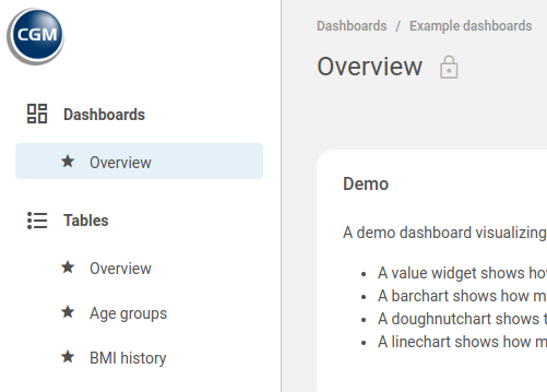
Favorite dashboards and tables can be shown on the left side of the UI with the following configuration:
dashboards:
  - name: "Overview"
    url: "#/dashboard/default"
tables:
  - name: "Overview"
    url: "#/table/explorer_patient/overview"
  - name: "Age groups"
    url: "#/table/explorer_patient/age_groups"
  - name: "BMI history"
    url: "#/table/explorer_patient/bmi_history"
The UI then shows:

